ShopDreamUp AI ArtDreamUp
![Shining Diamond [Contest Entry]](https://images-wixmp-ed30a86b8c4ca887773594c2.wixmp.com/f/e0be2f24-abbb-4a3c-a7d5-276883d09b17/dce2ra9-acfb4530-0ebb-4e61-9430-42c51bf3c8a0.png/v1/fill/w_1600,h_2263,q_80,strp/shining_diamond__contest_entry__by_chibiyvi_dce2ra9-fullview.jpg?token=eyJ0eXAiOiJKV1QiLCJhbGciOiJIUzI1NiJ9.eyJzdWIiOiJ1cm46YXBwOjdlMGQxODg5ODIyNjQzNzNhNWYwZDQxNWVhMGQyNmUwIiwiaXNzIjoidXJuOmFwcDo3ZTBkMTg4OTgyMjY0MzczYTVmMGQ0MTVlYTBkMjZlMCIsIm9iaiI6W1t7ImhlaWdodCI6Ijw9MjI2MyIsInBhdGgiOiJcL2ZcL2UwYmUyZjI0LWFiYmItNGEzYy1hN2Q1LTI3Njg4M2QwOWIxN1wvZGNlMnJhOS1hY2ZiNDUzMC0wZWJiLTRlNjEtOTQzMC00MmM1MWJmM2M4YTAucG5nIiwid2lkdGgiOiI8PTE2MDAifV1dLCJhdWQiOlsidXJuOnNlcnZpY2U6aW1hZ2Uub3BlcmF0aW9ucyJdfQ.Wz21wAgKajbM_VKmgnG5MeSIvtIgXjBTRnIsVGtEZY0)
Deviation Actions


![Racklet [Contest Winner]](https://images-wixmp-ed30a86b8c4ca887773594c2.wixmp.com/f/e0be2f24-abbb-4a3c-a7d5-276883d09b17/dcdn02w-698f531a-d52f-4e97-8571-2839b88eeaf8.png/v1/crop/w_92,h_92,x_0,y_10,scl_0.052631578947368,q_70,strp/racklet__contest_winner__by_chibiyvi_dcdn02w-92s.jpg?token=eyJ0eXAiOiJKV1QiLCJhbGciOiJIUzI1NiJ9.eyJzdWIiOiJ1cm46YXBwOjdlMGQxODg5ODIyNjQzNzNhNWYwZDQxNWVhMGQyNmUwIiwiaXNzIjoidXJuOmFwcDo3ZTBkMTg4OTgyMjY0MzczYTVmMGQ0MTVlYTBkMjZlMCIsIm9iaiI6W1t7ImhlaWdodCI6Ijw9MjI3MSIsInBhdGgiOiJcL2ZcL2UwYmUyZjI0LWFiYmItNGEzYy1hN2Q1LTI3Njg4M2QwOWIxN1wvZGNkbjAydy02OThmNTMxYS1kNTJmLTRlOTctODU3MS0yODM5Yjg4ZWVhZjgucG5nIiwid2lkdGgiOiI8PTE2MDAifV1dLCJhdWQiOlsidXJuOnNlcnZpY2U6aW1hZ2Uub3BlcmF0aW9ucyJdfQ.Nj9kxsWrOB0slDii_W51Eh98Ec0E8RCs5UhuMISkP0I)


![[OC] Poor Yorick](https://images-wixmp-ed30a86b8c4ca887773594c2.wixmp.com/f/16cd4c12-79eb-4358-b350-de317300bba5/dbnkazn-ea3de602-d611-4eb0-a927-b441d1224623.png/v1/crop/w_184,h_184,x_0,y_12,scl_0.2875/_oc__poor_yorick_by_toufufuwu_dbnkazn-92s-2x.png?token=eyJ0eXAiOiJKV1QiLCJhbGciOiJIUzI1NiJ9.eyJzdWIiOiJ1cm46YXBwOjdlMGQxODg5ODIyNjQzNzNhNWYwZDQxNWVhMGQyNmUwIiwiaXNzIjoidXJuOmFwcDo3ZTBkMTg4OTgyMjY0MzczYTVmMGQ0MTVlYTBkMjZlMCIsIm9iaiI6W1t7ImhlaWdodCI6Ijw9ODAwIiwicGF0aCI6IlwvZlwvMTZjZDRjMTItNzllYi00MzU4LWIzNTAtZGUzMTczMDBiYmE1XC9kYm5rYXpuLWVhM2RlNjAyLWQ2MTEtNGViMC1hOTI3LWI0NDFkMTIyNDYyMy5wbmciLCJ3aWR0aCI6Ijw9NjQwIn1dXSwiYXVkIjpbInVybjpzZXJ2aWNlOmltYWdlLm9wZXJhdGlvbnMiXX0.Lpcaga1ZSykT47PjabuwMO8ppujkExdvQvHdtRHbxrA)
![[OC] Poor Yorick](https://images-wixmp-ed30a86b8c4ca887773594c2.wixmp.com/f/16cd4c12-79eb-4358-b350-de317300bba5/dbnkazn-ea3de602-d611-4eb0-a927-b441d1224623.png/v1/crop/w_92,h_92,x_0,y_6,scl_0.14375/_oc__poor_yorick_by_toufufuwu_dbnkazn-92s.png?token=eyJ0eXAiOiJKV1QiLCJhbGciOiJIUzI1NiJ9.eyJzdWIiOiJ1cm46YXBwOjdlMGQxODg5ODIyNjQzNzNhNWYwZDQxNWVhMGQyNmUwIiwiaXNzIjoidXJuOmFwcDo3ZTBkMTg4OTgyMjY0MzczYTVmMGQ0MTVlYTBkMjZlMCIsIm9iaiI6W1t7ImhlaWdodCI6Ijw9ODAwIiwicGF0aCI6IlwvZlwvMTZjZDRjMTItNzllYi00MzU4LWIzNTAtZGUzMTczMDBiYmE1XC9kYm5rYXpuLWVhM2RlNjAyLWQ2MTEtNGViMC1hOTI3LWI0NDFkMTIyNDYyMy5wbmciLCJ3aWR0aCI6Ijw9NjQwIn1dXSwiYXVkIjpbInVybjpzZXJ2aWNlOmltYWdlLm9wZXJhdGlvbnMiXX0.Lpcaga1ZSykT47PjabuwMO8ppujkExdvQvHdtRHbxrA)
![[Fanart] Jeanne d'Arc](https://images-wixmp-ed30a86b8c4ca887773594c2.wixmp.com/f/1dbe9da7-66e1-4b09-9b86-090b7296fbea/dazvug5-5ce5aa8d-0c49-49f9-85e5-f14474301307.png/v1/crop/w_184,h_184,x_0,y_19,scl_0.18163869693978,q_70,strp/_fanart__jeanne_d_arc_by_foxykuro_dazvug5-92s-2x.jpg?token=eyJ0eXAiOiJKV1QiLCJhbGciOiJIUzI1NiJ9.eyJzdWIiOiJ1cm46YXBwOjdlMGQxODg5ODIyNjQzNzNhNWYwZDQxNWVhMGQyNmUwIiwiaXNzIjoidXJuOmFwcDo3ZTBkMTg4OTgyMjY0MzczYTVmMGQ0MTVlYTBkMjZlMCIsIm9iaiI6W1t7ImhlaWdodCI6Ijw9MTQzMiIsInBhdGgiOiJcL2ZcLzFkYmU5ZGE3LTY2ZTEtNGIwOS05Yjg2LTA5MGI3Mjk2ZmJlYVwvZGF6dnVnNS01Y2U1YWE4ZC0wYzQ5LTQ5ZjktODVlNS1mMTQ0NzQzMDEzMDcucG5nIiwid2lkdGgiOiI8PTEwMTMifV1dLCJhdWQiOlsidXJuOnNlcnZpY2U6aW1hZ2Uub3BlcmF0aW9ucyJdfQ.sK1lDUCLqDumaoIFXJgzUwyLYcf4hjVNpXZbNY8ot9M)
![[Fanart] Jeanne d'Arc](https://images-wixmp-ed30a86b8c4ca887773594c2.wixmp.com/f/1dbe9da7-66e1-4b09-9b86-090b7296fbea/dazvug5-5ce5aa8d-0c49-49f9-85e5-f14474301307.png/v1/crop/w_92,h_92,x_0,y_10,scl_0.090819348469891,q_70,strp/_fanart__jeanne_d_arc_by_foxykuro_dazvug5-92s.jpg?token=eyJ0eXAiOiJKV1QiLCJhbGciOiJIUzI1NiJ9.eyJzdWIiOiJ1cm46YXBwOjdlMGQxODg5ODIyNjQzNzNhNWYwZDQxNWVhMGQyNmUwIiwiaXNzIjoidXJuOmFwcDo3ZTBkMTg4OTgyMjY0MzczYTVmMGQ0MTVlYTBkMjZlMCIsIm9iaiI6W1t7ImhlaWdodCI6Ijw9MTQzMiIsInBhdGgiOiJcL2ZcLzFkYmU5ZGE3LTY2ZTEtNGIwOS05Yjg2LTA5MGI3Mjk2ZmJlYVwvZGF6dnVnNS01Y2U1YWE4ZC0wYzQ5LTQ5ZjktODVlNS1mMTQ0NzQzMDEzMDcucG5nIiwid2lkdGgiOiI8PTEwMTMifV1dLCJhdWQiOlsidXJuOnNlcnZpY2U6aW1hZ2Uub3BlcmF0aW9ucyJdfQ.sK1lDUCLqDumaoIFXJgzUwyLYcf4hjVNpXZbNY8ot9M)


![[CM] Sierra](https://images-wixmp-ed30a86b8c4ca887773594c2.wixmp.com/f/60891839-6606-4461-ac63-f476c77e7f9d/dd1zwed-5afca96d-5394-4b4e-8c04-75c283af6612.jpg/v1/crop/w_184,h_184,x_19,y_0,scl_0.070175438596491,q_70,strp/_cm__sierra_by_solchan_dd1zwed-92s-2x.jpg?token=eyJ0eXAiOiJKV1QiLCJhbGciOiJIUzI1NiJ9.eyJzdWIiOiJ1cm46YXBwOjdlMGQxODg5ODIyNjQzNzNhNWYwZDQxNWVhMGQyNmUwIiwiaXNzIjoidXJuOmFwcDo3ZTBkMTg4OTgyMjY0MzczYTVmMGQ0MTVlYTBkMjZlMCIsIm9iaiI6W1t7ImhlaWdodCI6Ijw9NTY0IiwicGF0aCI6IlwvZlwvNjA4OTE4MzktNjYwNi00NDYxLWFjNjMtZjQ3NmM3N2U3ZjlkXC9kZDF6d2VkLTVhZmNhOTZkLTUzOTQtNGI0ZS04YzA0LTc1YzI4M2FmNjYxMi5qcGciLCJ3aWR0aCI6Ijw9ODAwIn1dXSwiYXVkIjpbInVybjpzZXJ2aWNlOmltYWdlLm9wZXJhdGlvbnMiXX0.NK3fF9f70pgRrr21BxUaHk90eVnSoFxhxyFtF0jE3U4)
![[CM] Sierra](https://images-wixmp-ed30a86b8c4ca887773594c2.wixmp.com/f/60891839-6606-4461-ac63-f476c77e7f9d/dd1zwed-5afca96d-5394-4b4e-8c04-75c283af6612.jpg/v1/crop/w_92,h_92,x_10,y_0,scl_0.035087719298246,q_70,strp/_cm__sierra_by_solchan_dd1zwed-92s.jpg?token=eyJ0eXAiOiJKV1QiLCJhbGciOiJIUzI1NiJ9.eyJzdWIiOiJ1cm46YXBwOjdlMGQxODg5ODIyNjQzNzNhNWYwZDQxNWVhMGQyNmUwIiwiaXNzIjoidXJuOmFwcDo3ZTBkMTg4OTgyMjY0MzczYTVmMGQ0MTVlYTBkMjZlMCIsIm9iaiI6W1t7ImhlaWdodCI6Ijw9NTY0IiwicGF0aCI6IlwvZlwvNjA4OTE4MzktNjYwNi00NDYxLWFjNjMtZjQ3NmM3N2U3ZjlkXC9kZDF6d2VkLTVhZmNhOTZkLTUzOTQtNGI0ZS04YzA0LTc1YzI4M2FmNjYxMi5qcGciLCJ3aWR0aCI6Ijw9ODAwIn1dXSwiYXVkIjpbInVybjpzZXJ2aWNlOmltYWdlLm9wZXJhdGlvbnMiXX0.NK3fF9f70pgRrr21BxUaHk90eVnSoFxhxyFtF0jE3U4)


![[Commission] White Dressed Lady on the Rosefield](https://images-wixmp-ed30a86b8c4ca887773594c2.wixmp.com/f/cc62e0b3-8b01-43db-a94f-b9c3d1da4635/de2c9d3-fe0c1bab-b28b-46ca-9876-acd9da7d7dcf.jpg/v1/crop/w_184,h_184,x_19,y_0,scl_0.074193548387097,q_70,strp/_commission__white_dressed_lady_on_the_rosefield_by_tepanzz_de2c9d3-92s-2x.jpg?token=eyJ0eXAiOiJKV1QiLCJhbGciOiJIUzI1NiJ9.eyJzdWIiOiJ1cm46YXBwOjdlMGQxODg5ODIyNjQzNzNhNWYwZDQxNWVhMGQyNmUwIiwiaXNzIjoidXJuOmFwcDo3ZTBkMTg4OTgyMjY0MzczYTVmMGQ0MTVlYTBkMjZlMCIsIm9iaiI6W1t7InBhdGgiOiJcL2ZcL2NjNjJlMGIzLThiMDEtNDNkYi1hOTRmLWI5YzNkMWRhNDYzNVwvZGUyYzlkMy1mZTBjMWJhYi1iMjhiLTQ2Y2EtOTg3Ni1hY2Q5ZGE3ZDdkY2YuanBnIiwiaGVpZ2h0IjoiPD05MDUiLCJ3aWR0aCI6Ijw9MTI4MCJ9XV0sImF1ZCI6WyJ1cm46c2VydmljZTppbWFnZS53YXRlcm1hcmsiXSwid21rIjp7InBhdGgiOiJcL3dtXC9jYzYyZTBiMy04YjAxLTQzZGItYTk0Zi1iOWMzZDFkYTQ2MzVcL3RlcGFuenotNC5wbmciLCJvcGFjaXR5Ijo5NSwicHJvcG9ydGlvbnMiOjAuNDUsImdyYXZpdHkiOiJjZW50ZXIifX0.g55ywzyjnUOjTlk2fNqA-D7s_aMoN2tHKA66Ss7dZ0E)
![[Commission] White Dressed Lady on the Rosefield](https://images-wixmp-ed30a86b8c4ca887773594c2.wixmp.com/f/cc62e0b3-8b01-43db-a94f-b9c3d1da4635/de2c9d3-fe0c1bab-b28b-46ca-9876-acd9da7d7dcf.jpg/v1/crop/w_92,h_92,x_10,y_0,scl_0.037096774193548,q_70,strp/_commission__white_dressed_lady_on_the_rosefield_by_tepanzz_de2c9d3-92s.jpg?token=eyJ0eXAiOiJKV1QiLCJhbGciOiJIUzI1NiJ9.eyJzdWIiOiJ1cm46YXBwOjdlMGQxODg5ODIyNjQzNzNhNWYwZDQxNWVhMGQyNmUwIiwiaXNzIjoidXJuOmFwcDo3ZTBkMTg4OTgyMjY0MzczYTVmMGQ0MTVlYTBkMjZlMCIsIm9iaiI6W1t7InBhdGgiOiJcL2ZcL2NjNjJlMGIzLThiMDEtNDNkYi1hOTRmLWI5YzNkMWRhNDYzNVwvZGUyYzlkMy1mZTBjMWJhYi1iMjhiLTQ2Y2EtOTg3Ni1hY2Q5ZGE3ZDdkY2YuanBnIiwiaGVpZ2h0IjoiPD05MDUiLCJ3aWR0aCI6Ijw9MTI4MCJ9XV0sImF1ZCI6WyJ1cm46c2VydmljZTppbWFnZS53YXRlcm1hcmsiXSwid21rIjp7InBhdGgiOiJcL3dtXC9jYzYyZTBiMy04YjAxLTQzZGItYTk0Zi1iOWMzZDFkYTQ2MzVcL3RlcGFuenotNC5wbmciLCJvcGFjaXR5Ijo5NSwicHJvcG9ydGlvbnMiOjAuNDUsImdyYXZpdHkiOiJjZW50ZXIifX0.g55ywzyjnUOjTlk2fNqA-D7s_aMoN2tHKA66Ss7dZ0E)
![[C] Spectrum](https://images-wixmp-ed30a86b8c4ca887773594c2.wixmp.com/f/d9c416ab-efe2-46d1-a55b-fa295e9737e4/dcc2yvt-d1741b2b-680e-42e9-ae8a-954bc5b0e0d5.jpg/v1/crop/w_184,h_184,x_0,y_19,scl_0.16727272727273,q_70,strp/_c__spectrum_by_llewsart_dcc2yvt-92s-2x.jpg?token=eyJ0eXAiOiJKV1QiLCJhbGciOiJIUzI1NiJ9.eyJzdWIiOiJ1cm46YXBwOjdlMGQxODg5ODIyNjQzNzNhNWYwZDQxNWVhMGQyNmUwIiwiaXNzIjoidXJuOmFwcDo3ZTBkMTg4OTgyMjY0MzczYTVmMGQ0MTVlYTBkMjZlMCIsIm9iaiI6W1t7ImhlaWdodCI6Ijw9MTU1NiIsInBhdGgiOiJcL2ZcL2Q5YzQxNmFiLWVmZTItNDZkMS1hNTViLWZhMjk1ZTk3MzdlNFwvZGNjMnl2dC1kMTc0MWIyYi02ODBlLTQyZTktYWU4YS05NTRiYzViMGUwZDUuanBnIiwid2lkdGgiOiI8PTExMDAifV1dLCJhdWQiOlsidXJuOnNlcnZpY2U6aW1hZ2Uub3BlcmF0aW9ucyJdfQ.uZG-tFVMVUBAJIJVQLzZ9hNIpxwfc5lrZ_tusHRmXlM)
![[C] Spectrum](https://images-wixmp-ed30a86b8c4ca887773594c2.wixmp.com/f/d9c416ab-efe2-46d1-a55b-fa295e9737e4/dcc2yvt-d1741b2b-680e-42e9-ae8a-954bc5b0e0d5.jpg/v1/crop/w_92,h_92,x_0,y_10,scl_0.083636363636364,q_70,strp/_c__spectrum_by_llewsart_dcc2yvt-92s.jpg?token=eyJ0eXAiOiJKV1QiLCJhbGciOiJIUzI1NiJ9.eyJzdWIiOiJ1cm46YXBwOjdlMGQxODg5ODIyNjQzNzNhNWYwZDQxNWVhMGQyNmUwIiwiaXNzIjoidXJuOmFwcDo3ZTBkMTg4OTgyMjY0MzczYTVmMGQ0MTVlYTBkMjZlMCIsIm9iaiI6W1t7ImhlaWdodCI6Ijw9MTU1NiIsInBhdGgiOiJcL2ZcL2Q5YzQxNmFiLWVmZTItNDZkMS1hNTViLWZhMjk1ZTk3MzdlNFwvZGNjMnl2dC1kMTc0MWIyYi02ODBlLTQyZTktYWU4YS05NTRiYzViMGUwZDUuanBnIiwid2lkdGgiOiI8PTExMDAifV1dLCJhdWQiOlsidXJuOnNlcnZpY2U6aW1hZ2Uub3BlcmF0aW9ucyJdfQ.uZG-tFVMVUBAJIJVQLzZ9hNIpxwfc5lrZ_tusHRmXlM)


![Mizuki [portrait]](https://images-wixmp-ed30a86b8c4ca887773594c2.wixmp.com/f/10430471-4efe-4cf0-8ca1-3bce19cc1ce7/de9fvb2-7c5fd598-fbf4-4dd5-8e77-e06cba813954.png/v1/crop/w_184,h_184,x_0,y_10,scl_0.063601797442102,q_70,strp/mizuki__portrait__by_humaninosuke_de9fvb2-92s-2x.jpg?token=eyJ0eXAiOiJKV1QiLCJhbGciOiJIUzI1NiJ9.eyJzdWIiOiJ1cm46YXBwOjdlMGQxODg5ODIyNjQzNzNhNWYwZDQxNWVhMGQyNmUwIiwiaXNzIjoidXJuOmFwcDo3ZTBkMTg4OTgyMjY0MzczYTVmMGQ0MTVlYTBkMjZlMCIsIm9iaiI6W1t7ImhlaWdodCI6Ijw9MTU2NyIsInBhdGgiOiJcL2ZcLzEwNDMwNDcxLTRlZmUtNGNmMC04Y2ExLTNiY2UxOWNjMWNlN1wvZGU5ZnZiMi03YzVmZDU5OC1mYmY0LTRkZDUtOGU3Ny1lMDZjYmE4MTM5NTQucG5nIiwid2lkdGgiOiI8PTEyODAifV1dLCJhdWQiOlsidXJuOnNlcnZpY2U6aW1hZ2Uub3BlcmF0aW9ucyJdfQ.nBWj8hf8_1NEmBVyE5-0cX4rGXrsZ2-dcKuBgARLxH4)
![Mizuki [portrait]](https://images-wixmp-ed30a86b8c4ca887773594c2.wixmp.com/f/10430471-4efe-4cf0-8ca1-3bce19cc1ce7/de9fvb2-7c5fd598-fbf4-4dd5-8e77-e06cba813954.png/v1/crop/w_92,h_92,x_0,y_5,scl_0.031800898721051,q_70,strp/mizuki__portrait__by_humaninosuke_de9fvb2-92s.jpg?token=eyJ0eXAiOiJKV1QiLCJhbGciOiJIUzI1NiJ9.eyJzdWIiOiJ1cm46YXBwOjdlMGQxODg5ODIyNjQzNzNhNWYwZDQxNWVhMGQyNmUwIiwiaXNzIjoidXJuOmFwcDo3ZTBkMTg4OTgyMjY0MzczYTVmMGQ0MTVlYTBkMjZlMCIsIm9iaiI6W1t7ImhlaWdodCI6Ijw9MTU2NyIsInBhdGgiOiJcL2ZcLzEwNDMwNDcxLTRlZmUtNGNmMC04Y2ExLTNiY2UxOWNjMWNlN1wvZGU5ZnZiMi03YzVmZDU5OC1mYmY0LTRkZDUtOGU3Ny1lMDZjYmE4MTM5NTQucG5nIiwid2lkdGgiOiI8PTEyODAifV1dLCJhdWQiOlsidXJuOnNlcnZpY2U6aW1hZ2Uub3BlcmF0aW9ucyJdfQ.nBWj8hf8_1NEmBVyE5-0cX4rGXrsZ2-dcKuBgARLxH4)


Description
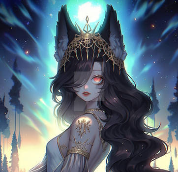
I'm really proud of that picture! ![]()

I loved to draw Diamond/Daya this amazing OC belongs to Miunadeli and I did it for her amazing contest:![]()
Draw my OCs Contest~ [Open] $100+ / core / artwork


NEWS
The contest will be extended until July 1st
&
2 more prizes will be added:
- 1 chibi by Neiziel
- 1 little chibi by Neiziel
(For these two I will pick two arts that really get to me ♥)
I hope that you are all having fun so far!!  Hi guys!
It's been quite a long time since I've been thinking of doing a "draw my OCs" co
You can find more informations about Diamond here:
I hope you like her! And good luck with the contest to every one!![Hamtaro Mouse Emoji-02 (Kawaii) [V1]](https://orig00.deviantart.net/0195/f/2014/170/f/1/hamtaro_mouse_emoji_02__kawaii___v1__by_jerikuto-d7n4wih.gif)
Image size
4961x7016px 33.53 MB
© 2018 - 2024 ChibiYvi
Comments42
Join the community to add your comment. Already a deviant? Log In
Beautiful piece, the composition and the lighting is top notch. The rendering is a little messy but I think in a way it brought personality to your piece. I think you did a great job on filling the space of the dimensions you used. The character you drew was definitely the first thing my eye went to as a focal point. The fact that you blurred out the blood spatter definitely helped make her stand out more. The consistent lighting is great as well. The fact that you stayed true to having your light source behind her was definitely a big plus since that's an error many artists make.
Now as for my critique, although most of your anatomy is well done I think some areas of improvement could be making her thighs and fingers more well-defined. Her fingers are a bit too flowy and I think there should be some emphasis on the bend of her fingers especially since she is holding something. I think the torso is beautifully done as it emphasized her curvy and fit physique overall It makes the outfit all the more gorgeous. As for her thighs there should be a distinction between her butt and her thigh. Maybe a little dent to indicate where her bottom ends and where her thighs start. The scythe is overall well done except the blade looks like you forced it to curve to that I would fit your dimensions, but I think you could've extended the end of the blade to the bottom right to frame the character even more.
For her clothes, I think the ruffles on her skirt were beautifully done! Although the back of her skirt looks a little weird. But the jewels hanging those chains on the belt of her shirt shouldn't all be facing the same direction but I think some should be turning to increase the realistic aspect of the piece. As for the metal/ jewel thing near her neck If it is meant to be metallic I don't think It should curve as well, but if its a design then ignore my critique.
Your colours are great in terms of contrast but I think they look a little greyed out. I think this is due to the fact that when you were shading you probably just picked colours that were closer to black which led to graying the piece out. You should increase the saturation of the colour you used for shading to make your piece pop a little more. I love the little glowing effect you added on her right hand, its a small detail but it goes to show your attention for detail.
Her neck and head seem like they're a bit to the left for her body, although her facial proportions are beautiful. As well as the amazing rendering of her hair !! Her facial expression is a little to blank for me. Although I can see she is smiling a little bit the piece could've been brought to a new level if you added more personality to her.
The background was a good choice and the moon looks gorgeous but the stars I feel could've been improved by making them more scattered as stars aren't naturally evenly spaced out.
Overall the piece was beautifully created, tiny fixes could've made this piece more beautiful that it already is!
I hope the my critiques weren't too harsh. I only said a lot because you can definitely make it big one day with the talent you already have!